


 Kay Nielson, From East of the Sun, West of the Moon.
For all of the debating and eye gouging that goes on over the various artists and styles of art that have appeared in the many products and versions of Dungeons & Dragons over the years, I think that the fact that there have been so many different artist's sensibilities involved has been an overlooked factor in the popularity of the game itself.
Everyone has a different picture in their head of what the game world looks like, what the monsters look like, the appearance of their characters. Because this all goes on in the heads of the players and not on a screen in a theater, or the pages of a book, all involved are able to imagine the scenes that best suit their own taste. No conflict.
Any of the early modules from TSR might have the work of six or more artists in them. These illustrations would have widely varying styles and approaches to the subject matter. With multiple visual styles to choose from, almost everyone could find something that appealed to them. People tend to focus on the things that attract them and ignore that which evokes no emotional response. That leaves them free to re-illustrate the module in their head to their own satisfaction, with the art style they like, and ignore the others.
The lack of art direction for early TSR was a strength, not a weakness. The fact that later products have a gradually more and more unified art look is an obstacle to immersion in the game for those who's taste differs from the chosen look. At least in my own case, that is.
Any way, The Suel. I said before I like to repurpose old art for D&D, and the Kay Nielson plate at top is allot like what is envision the old Suel Empire to have looked like. A somewhat Nordic people and culture in a land of green hills and lakes with a subtle and complex style of art and clothing. Before the Rain of Colorless Fire burned it all to ash, it would have been the jewel of Oerth.
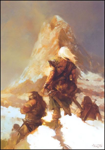 This is from Justin Sweet. Not at all an old picture, but one I think fits perfectly with my own mental image of the Thrillonian Peninsula. That far spear of land the survivors of the ruined empire fled to. I found this image online, listed as untitled, and I have no idea if it has been used in any official D&D product.
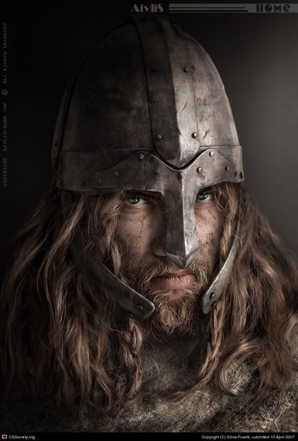 This is by Silvia Fusetti, I normally don't care for computer generated art, but the photo realism of this is brilliant. In my mind, this is what you're facing when the fruzti board your wallowing old cog off the coast of the Great Kingdom . Look at that guy's eyes and tell me you can't feel the hunger of the war wolf.
 It wasn't the intentions of the original artists, but I've connected all three works to illustrate the mental image I have of the Suel of the World of Greyhawk. Each of these pieces is completely different in style, tone, and presentation. Any one of them may or may not appeal to you, but you are free to reimagine them as you wish. The point is, the grouping is not monolithic and uniform in direction. Heavy handed art direction chokes off a part of the viewing audience from the get go.
If a style of art you don't care for fills a product to the exclusion of all others, you're a lot less likely to give it a chance. No matter how good the writing may be, I'm just not gonna pick up the module that's loaded with glossy images of spiky, strappy, pouch covered, manga-haired, leather wrapped, impractical armor wearing, dragon halfling warlord emo thieves.
To each his own.

1 comment:
Nice - I never thought of the Old Suel as Slavic/Rus in tone, but that's a nice idea that works better than Romanesque or Germanic IMO.
Post a Comment